Visualizing complex systems is essential for understanding and addressing the multifaceted challenges we face in various fields, from environmental science to urban planning. By employing effective visualization techniques, we can gain deeper insights into intricate relationships, identify leverage points for intervention, and communicate complex ideas more clearly. This blog explores the concept of complex systems, the importance of visualization, and three effective methods to visualize these systems, along with their pros and cons.
What Are Complex Systems?
Complex systems are networks of interconnected components that exhibit behaviors and properties not evident when examining individual parts. They are characterized by several key features:
- Interconnectedness: Complex systems consist of many moving parts that are interconnected and interdependent. A change in one component can significantly affect others, leading to unpredictable outcomes.
- Non-determinism: The behavior of complex systems is often non-linear and cannot be easily predicted. This unpredictability means that interventions may have unintended consequences.
- Emergence: Complex systems display emergent properties, where the collective behavior of the system is more than the sum of its individual parts. For example, the behavior of an ant colony cannot be understood by simply analyzing individual ants.
- Sensitivity to Initial Conditions: This characteristic, often referred to as the “butterfly effect,” indicates that small changes in initial conditions can lead to vastly different outcomes. This means that interventions must be tailored to specific contexts rather than applied universally.
An example of a complex system is the global climate system, where numerous variables, including atmospheric conditions, ocean currents, and human activities, interact in ways that are often difficult to predict. Understanding the interplay between these elements is crucial for addressing issues like climate change and environmental degradation.

Image from:Start Systems Mapping Right Now (6 awesome options) - Bryan Lindsley
What Does It Mean to Visualize a Complex System?
Visualizing a complex system involves creating representations that highlight the relationships and dynamics within the system. This process helps to distill complex information into more manageable and understandable formats. Visualization can take many forms, including diagrams, flowcharts, and interactive maps, each designed to convey specific aspects of the system.
The goal of visualization is to develop a shared understanding among stakeholders, facilitating communication and collaboration. By representing the system visually, we can identify patterns, relationships, and potential areas for intervention. For instance, a systems map can illustrate how various factors contribute to a public health issue, allowing stakeholders to see the bigger picture and prioritize actions.
Why Do We Need to Visualize a Complex System?
Visualizing complex systems is crucial for several reasons:
- Enhanced Understanding: Complex systems are often difficult to comprehend due to their intricate nature. Visualization helps simplify these systems, making it easier to grasp their dynamics and interactions.
- Identifying Leverage Points: By visualizing a system, we can pinpoint areas where interventions may have the most significant impact. This understanding is vital for effective decision-making and resource allocation.
- Facilitating Communication: Visual representations provide a common language for stakeholders, enabling clearer discussions about the system and potential interventions. This is particularly important in multidisciplinary teams where members may have different backgrounds and terminologies.
- Monitoring Changes: As complex systems evolve, visualizations can be updated to reflect new data and insights. This adaptability allows for ongoing assessment and adjustment of strategies.
- Engaging Stakeholders: Visual tools can engage stakeholders by making complex information more accessible. This engagement fosters collaboration and collective problem-solving.
What Are the Three Ways to Visualize a Complex System?
1.System Mapping
System mapping is a powerful technique for visualizing relationships and interactions within a complex system. It involves creating diagrams that represent components, their connections, and feedback loops.

Image from:IFIC Ireland Webinar: Implementing Integrated Care in Northern Ireland on Vimeo
How to Create a System Map:
- Gather Information: Start by collecting relevant data about the system you want to map. This includes understanding the components, their interactions, and the context in which they operate.
- Identify Key Components: List all the elements involved in the system. This could include stakeholders, processes, and resources.
- Establish Relationships: Draw connections between the components to illustrate how they interact. Use arrows to indicate the direction of influence.
- Identify Feedback Loops: Look for feedback mechanisms where changes in one component affect others. This helps to highlight dynamic interactions within the system.
- Create the Diagram: Use software tools like Kumu or draw it by hand to create a visual representation of the system. Ensure that the layout is clear and logical.
- Refine and Iterate: Review the map with stakeholders to ensure accuracy and clarity. Make adjustments based on feedback to enhance understanding.
Pros and Cons:
- Pros: Provides a holistic view of the system, helps identify key players and their roles, and facilitates understanding of feedback loops and dynamics.
- Cons: Can become cluttered and difficult to interpret if too many elements are included, and requires ongoing updates to remain relevant.
Example:
A system map of a city’s transportation network might illustrate how various modes of transport (buses, trains, bicycles) interact and affect traffic congestion.
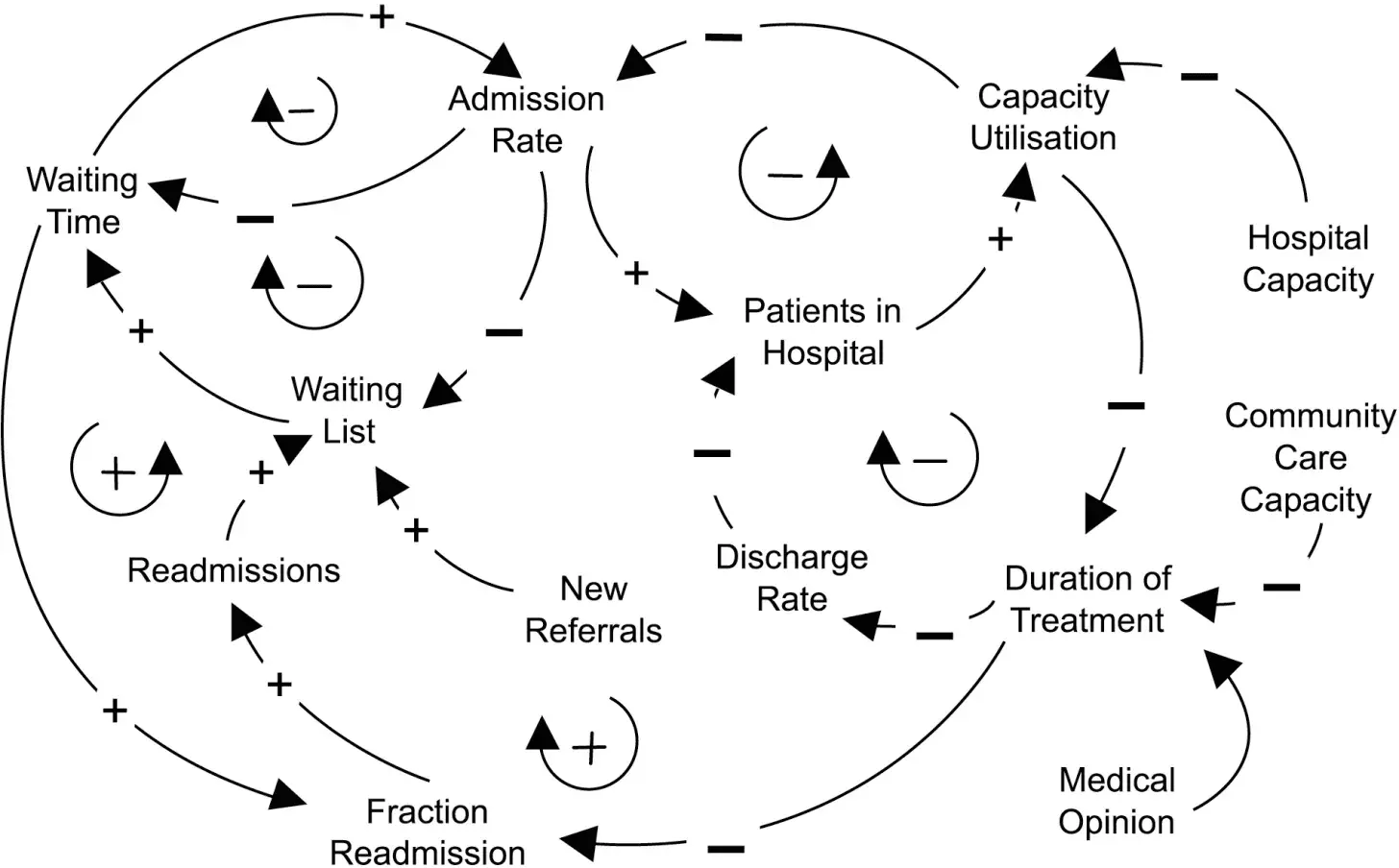
Causal loop diagrams (CLDs) are used to represent the cause-and-effect relationships within a system. They highlight feedback loops, showing how changes in one variable can influence others.
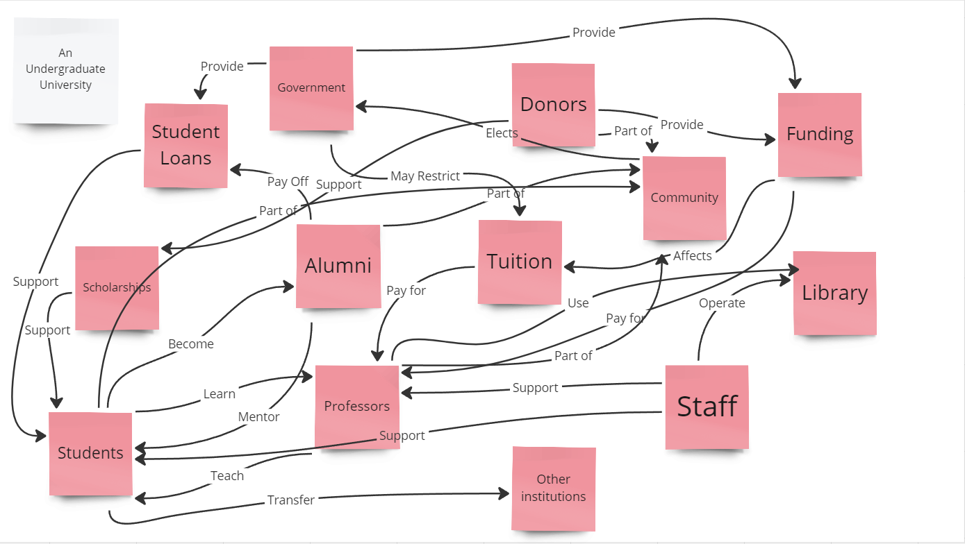
Image from: MacEwan University
How to Create a Causal Loop Diagram:
- Define the Purpose: Start by clarifying what you want to analyze or communicate with the CLD. This will guide the focus of your diagram.
- Identify Variables: List the key variables that influence the system. These could be factors like population growth, resource availability, or economic conditions.
- Establish Causal Relationships: Determine how the variables are connected. Use arrows to indicate the direction of influence (positive or negative).
- Identify Feedback Loops: Look for reinforcing (positive) and balancing (negative) loops. Label these loops to clarify their nature.
- Draw the Diagram: Use software tools like Vensim or Insight Maker to create the diagram. Ensure that it is visually clear and easy to understand.
- Validate with Stakeholders: Share the diagram with stakeholders to ensure it accurately represents the system dynamics. Adjust as necessary based on their input.
Pros and Cons:
- Pros: Clearly illustrates feedback mechanisms, helps identify reinforcing and balancing loops, and is useful for scenario planning.
- Cons: May oversimplify complex interactions, and requires a solid understanding of the system to create effectively.
Example:
A CLD of an ecosystem might show how predator and prey populations interact, illustrating the balance necessary for maintaining ecological health.
Interactive data visualization tools, such as Kumu or Tableau, allow users to create dynamic maps that can be manipulated to explore different scenarios and relationships. These tools enable users to visualize data in real-time, making it easier to identify trends and patterns.

Image from:London Underground Tube Map Art Silk Poster Home Wall Decor | Shopee Singapore
- Select a Tool: Choose an appropriate visualization tool based on your needs. Kumu is excellent for system mapping, while Tableau is great for data analysis.
- Import Data: Gather and import relevant data into the tool. This could include quantitative data, qualitative insights, or existing maps.
- Build the Visualization: Use the tool’s features to create a dynamic representation of the system. This may involve selecting templates, adding elements, and establishing connections.
- Add Interactivity: Incorporate interactive elements that allow users to manipulate the data, such as filters, sliders, or clickable elements. This enhances user engagement and understanding.
- Test and Refine: Share the visualization with users to gather feedback. Make adjustments to improve clarity and usability.
- Present Findings: Use the interactive visualization to present insights to stakeholders, facilitating discussions and decision-making.
Pros and Cons:
- Pros: Engages users by allowing them to interact with the data, facilitates exploration of various scenarios, and can handle large datasets.
- Cons: Requires technical skills to create and maintain, and may involve a learning curve for users unfamiliar with the tools.
Example:
Using Kumu, a user can create an interactive map of stakeholders in a community project, allowing for exploration of relationships and influence among different organizations.
Conclusion
Visualizing complex systems is an essential practice for understanding and addressing the multifaceted challenges we face today. By employing techniques such as system mapping, causal loop diagrams, and interactive data visualization tools, we can gain deeper insights into the relationships and dynamics within these systems. This understanding enables us to identify leverage points for intervention, communicate effectively with stakeholders, and adapt our strategies as systems evolve.
As we continue to confront complex issues—ranging from climate change to public health—embracing visualization techniques will be crucial for fostering collaboration and driving meaningful change. By utilizing these methods, we can better navigate the intricacies of complex systems and work towards creating sustainable solutions for the future.