In the field of data visualization, choosing the right chart type is crucial to effectively presenting and understanding information. Two common data visualization tools, Tree Map and Hierarchical Map, each have their own unique advantages and use cases. This article will delve into the features, pros and cons of both types of charts, and how to choose the tool that best suits your needs.
What is a Tree Map?
A Tree Map is a chart that presents data in a nested rectangle. The area of each rectangle represents the size of the data, while the color of the rectangle can be used to represent other information. The advantage of Tree Map is that it can effectively display the hierarchical relationship and proportion of data, especially for processing a large number of classified data.

image from: Printable Templates Free
Advantages of Tree Map:
Tree Map uses a rectangular area to display the size of data, which makes the information display very compact and suitable for displaying a large amount of data in a limited space.Tree Map is designed to allow a rich data set to be displayed in a relatively small area. The size of each rectangle is proportional to the data value, and multiple nested rectangles can be displayed side by side in the same view. This compact layout is ideal for data-intensive scenarios, such as departmental expenditures in financial statements, product categories in market research, and so on. Compared with traditional bar charts or pie charts, Tree maps can present more details in a smaller space, avoiding space waste and enabling users to obtain more information in a limited visual scope.
- Clear hierarchical relationship:
Through different rectangular layers, the Tree Map can intuitively display the hierarchical structure of data, so that users can quickly understand the classification and subclassification of data.In the Tree Map, the area of each rectangle is adjusted according to the relative size of the data, so the user can see the amount of data for each category at a glance by the size of the rectangle. This visual presentation is particularly suitable for comparing the proportion between different categories, such as sales of different product lines, budget allocation of various departments, and so on. Users can visually see which category has the largest proportion and which has the smallest, and can even quickly spot anomalies or trends in the data without complicated calculations or look-ups.
With color coding, users can view additional dimensional information, such as trends in data or other metrics, in the same chart.In addition to the rectangular area, Tree maps also allow the use of color to convey more information. With different colors, users can identify another dimension of data in the same chart, such as showing data changes over different time periods, different categories of performance indicators, etc. For example, in a Tree Map, the color of the rectangle can be used to represent the growth rate or market share trend of each department, so that users can see not only the actual size of each department, but also how well it is performing. This multi-dimensional presentation of data enhances Tree Map’s ability to convey information, allowing users to gain more comprehensive insights in a single chart.
Disadvantages of Tree Map:
- Difficult to display exact values:
Since the size of the rectangle is only used for comparison, exact values are difficult to read from the chart.The main feature of a Tree Map is that the size of the data is reflected by the area of the rectangle. While this method is effective at showing relative proportions of data, it may not be ideal when it comes to precise numerical values. Since the area of a rectangle is a visual representation, users may have difficulty estimating the value of the data. Especially when the rectangular area difference is small, the visual accuracy is limited, making it more difficult to accurately read the specific value. While many Tree Map implementations provide tooltips or data labels to help users get accurate values, these features can sometimes be less intuitive when the data is large or when rectangles overlap, and users may still need extra time to parse the data.
For very deep layers or a large number of data types, the Tree Map may appear complex, affecting the reading experience.Tree Map displays the hierarchy of data by nesting rectangles to represent the hierarchy of each data point. However, when the hierarchical depth of the data is large, the structure of this nested rectangle can become very complex, resulting in a decrease in the readability of the chart. Rectangles at each level can become very small, making labels and data difficult to read. In addition, as levels increase, each rectangle in the chart can become crowded and cluttered, making it difficult to effectively convey information about the hierarchical structure and scale of the data. In such cases, users may be confused or have difficulty quickly accessing the information they need, so Tree Maps dealing with very deep data structures may require additional design optimizations, such as expansion and collapse capabilities, to help manage the complexity.
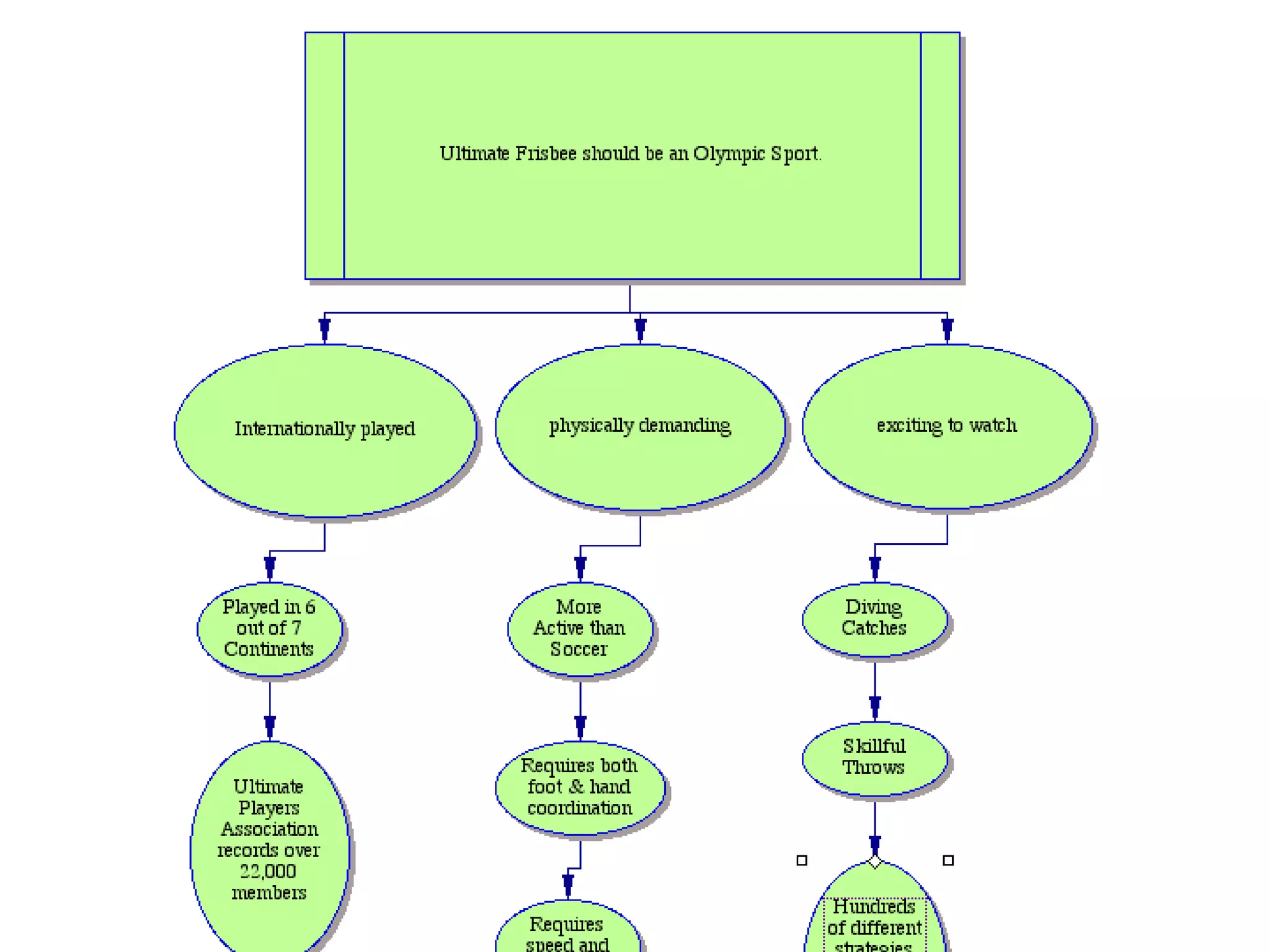
Image from:Slideshare
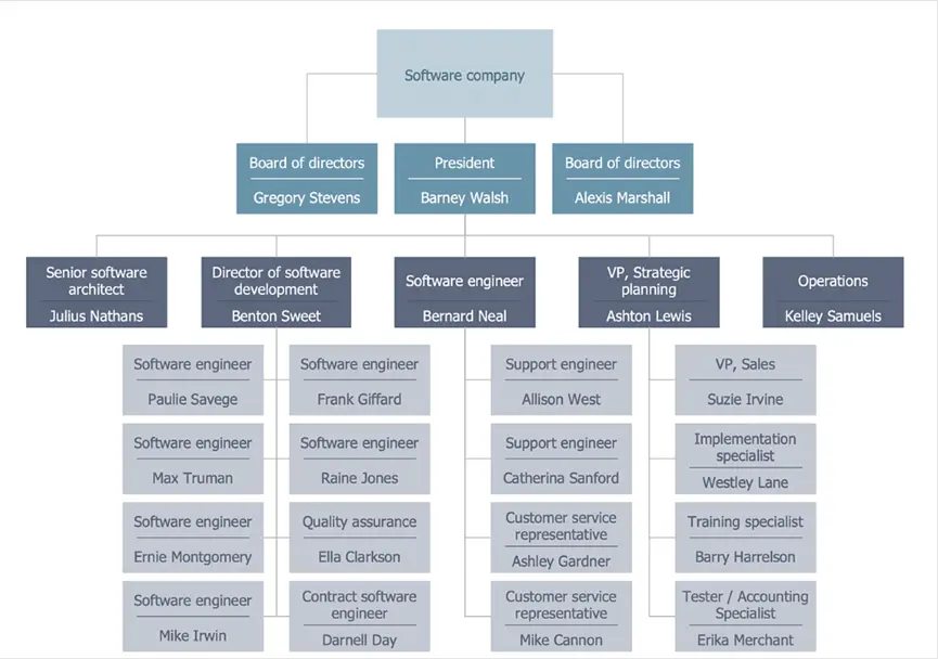
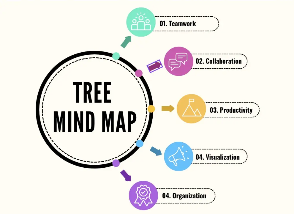
What is a Hierarchical Map?
Hierarchical maps generally refer to maps that present information using a hierarchical structure. The most common forms include Tree diagrams and Organizational charts. Hierarchical Maps show data relationships in the form of hierarchical nodes and connecting lines, and are suitable for displaying data with clear parent-child relationships.
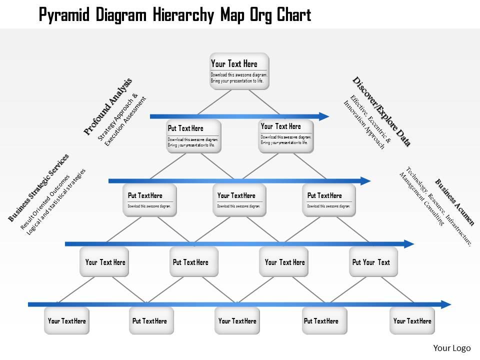
image from:Slide Team
Advantages of Hierarchical Map:
Hierarchical Maps clearly show the relationships between data elements in the form of nodes and connecting lines, making them ideal for displaying organizational structures or flowcharts. Hierarchical Maps use nodes and lines to show the hierarchical structure of data. This visualization method can visually show the parent-child relationship between data items, making the hierarchical distribution and organizational structure of each level clear. For example, in the organizational structure chart, the top node may represent the president of the company, and the following nodes in turn represent the department manager, team leader, etc., which can clearly show the position and relationship of each node in the overall structure. This clear hierarchy enables users to quickly understand how data is organized, helping to identify key points and relationships in the structure, especially when dealing with complex organizational structures or workflows.
The hierarchical structure makes data relationships clear at a glance, and users can quickly understand the role and location of each node.The structured presentation of Hierarchical Maps creates clear hierarchical relationships through nodes and lines, allowing users to quickly understand how data is organized. Compared to other chart types, the intuitive structure of hierarchical maps helps users grasp the overall framework and details of their data more quickly. For example, when displaying the relationship between departments and employees in a company, the clear layout of the hierarchy map allows users to immediately identify the relationship between superiors and subordinates and the reporting path of each department. This structured approach reduces the cognitive burden on users when making sense of complex data, making the interpretation of data more intuitive and natural. This ease of understanding makes Hierarchical Maps ideal for presenting data with clear hierarchical relationships and structures
- Detailed information display
Each node can be accompanied by detailed information, suitable for hierarchical data that requires detailed interpretation.Each node of a Hierarchical Map can represent not only a hierarchy, but also rich detailed information such as text descriptions, data values, ICONS, or links. This design allows the user to gain insight into the specifics of each node, not just its position in the hierarchy. For example, in a hierarchy diagram in project management, each task node can display details such as a task description, schedule, person in charge, and due date. This presentation of detailed information allows users to get a comprehensive background of data in the same view, facilitating accurate decisions or detailed analysis without having to jump to other views or documents.
Disadvantages of Hierarchical Maps:
For very large data sets, Hierarchical maps may appear overcrowded due to space constraints.Hierarchical maps, such as tree diagrams or organizational charts, can struggle with space constraints when dealing with very large datasets. As the number of nodes increases, the map can become crowded, leading to overlapping lines and nodes. This congestion can make it difficult for users to discern individual elements and relationships clearly. For instance, an organization chart for a large corporation with numerous departments and employees may become so dense that the names and roles of employees become unreadable. To address this, designers might need to implement strategies such as zooming and panning features, collapsible sections to hide and reveal details, or segmented views to break down the chart into more manageable parts. Despite these solutions, managing space efficiently remains a challenge for hierarchical maps when handling extensive data.
A deeper level structure can cause the chart to become complex and difficult to read.Hierarchical maps can become increasingly complex as the level depth increases. Each additional layer of hierarchy adds another dimension to the chart, which can make the map more intricate and harder to follow. For example, in a detailed project management chart, if each project phase is broken down into tasks and sub-tasks, and each task is further divided into action items, the resulting map can become highly complex. Users may find it challenging to navigate through the multiple layers, particularly if the chart lacks interactive features or if it is presented in a static format. To mitigate this issue, it is often beneficial to employ features such as expandable/collapsible nodes, hierarchical filters, and interactive drill-downs that allow users to focus on specific levels of detail without being overwhelmed by the entire structure. Even with these enhancements, deep hierarchical structures require careful design to ensure clarity and usability.

Image from:Wondershare EdrawMax
Tree Map and Hierarchical Map selection guide
Whether you choose a Tree Map or Hierarchical Map depends on your data characteristics and presentation needs:
If you need to present a large amount of classified data in a limited space, Tree Map is a good choice. It makes efficient use of space and displays the relative proportions of data. However, if the data volume is relatively small or the level is deep, Hierarchical maps can better show the detailed hierarchical relationships.
Tree Map excels in scenarios where there is a need to visualize a large volume of classified data within a confined area. Its use of nested rectangles to represent data allows for the compact and effective display of numerous categories and their proportions. For instance, in a dashboard displaying various product sales figures across multiple regions, a Tree Map can efficiently use the available screen space to show how each product’s sales compare to others. Conversely, if the data set is smaller or the hierarchical structure is deep, a Hierarchical Map becomes more advantageous. It allows for a clearer and more detailed display of complex hierarchical relationships. For example, in an organizational chart with several layers of management, a Hierarchical Map helps in understanding the detailed structure and relationships, which might be difficult to discern in a Tree Map where deep levels of nesting can cause confusion and reduce clarity.
Hierarchical Maps are more intuitive if your primary goal is to show the hierarchy and structure of your data. If your goal is to show the scale and overall distribution of your data, a Tree Map provides better visuals.
When the main objective is to convey the hierarchical structure and relationships within the data, Hierarchical Maps offer a more intuitive and structured view. For example, in an organizational chart, a Hierarchical Map clearly delineates the reporting lines, departments, and roles, making it easy for users to understand the chain of command and organizational layout. On the other hand, if the focus is on showcasing the scale and distribution of data across various categories, Tree Maps are more effective. They provide a clear visual representation of proportions and comparisons. For example, when comparing market shares of different companies within a sector, a Tree Map’s ability to display varying sizes of rectangles makes it easier to see which companies hold the largest shares and how they compare against each other.
With the Tree Map, users can quickly perceive the proportion of data, but additional tools may be required to view detailed information. Hierarchical maps are suitable for situations where you need to see the details of each data point with precision.
Tree Maps offer an immediate visual impact by allowing users to quickly grasp the proportions and relationships between different categories of data. The size of the rectangles provides a clear indication of the relative magnitude of each data point, which is particularly useful for high-level comparisons. However, if users need to delve into detailed information about specific categories, they may need to use additional features such as hover-over tooltips or drill-down options to access precise data points, as the visual representation alone may not suffice for detailed analysis.
Hierarchical Maps, in contrast, excel in situations where precise details and the relationships between individual data points are crucial. By presenting data in a structured, node-and-line format, Hierarchical Maps allow users to explore each node’s details and understand the specific hierarchical connections. For example, in a project management scenario where tracking the progress of various tasks and subtasks is essential, a Hierarchical Map enables users to see detailed information about each task and its dependencies, which facilitates a thorough and accurate analysis.
Summary
Tree Map and Hierarchical Map each have their own unique advantages and application scenarios. Tree maps are good for displaying large amounts of categorical data and scale information, whereas Hierarchical maps are good for displaying detailed hierarchical structures and relationships. Understanding the features and scenarios of these two tools can help you better choose the right data visualization tool to communicate your data story more effectively.